Hello All
As you may know we have had the opportunity to work on numerous
vintage animation memorabilia, and if you don't know check out our portfolio
to see some of the interesting pieces we have worked on in the past.
This post will mainly be involving Animation drawings on celluloid and paper, along with the backgrounds that help to enhance them.
During this post we will be showing you the process that was undertaken to enhance each of the six pieces.
Here are the six pieces in their original condition.
#1 The Flintstones - Season 3, Episode 23 "The Dress Rehearsal" - 1963
Issue to be addressed - Animator originally drew to the edge of paper, leaving the piece
feeling unfinished.
Our Client brought this piece in and upon opening the packaging, we realized that there was only half an image.
With the irregular look of the piece, the client was contemplating on scrapping the idea of framing,
that is until an idea came to us on how to rectify the situation.
So we scoured the internet, to find the original animation, once found we had the pleasure of revisiting this old classic, finding the exact scene that correlated to the drawing.
Here is what we found.
Then with the magic of photoshop we began to piece together the rest of the image,
by utilizing printing on both cardstock and acetate paper we were able to bring all the pieces together into a one cohesive piece.

Once that part was done, we went ahead with framing the piece, which looks like this.

Framed with a double matting and a fillet insert in between, with a matching distressed frame.
#2 Donald Duck - "Beach Picnic" - 1939
Issue to be addressed - Extremely low resolution background.
Now in this situation, the background used was actually the original background in the animation, but the low-res quality and the general plainness of the scene, a little artistic merit was taken to create a more interesting scene. All assets used are from the original animation, only they have undergone some slight manipulation.

Once approved by the client it went off to the printers and then onto framing.

Framed with a double matting with a shadow in between to pull the glass away from the celluloid, with a driftwood styled frame.
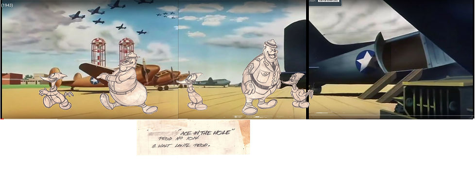
#3 Woody Woodpecker - "Ace In The Hole" - 1940
Issue to be addressed - drawings in multiple pieces that were cut by hand, then they were adhered to the title paper with what we believe to be rubber cement, and then once the adhesive had worn off over time, adhesive tape was applied to hold the pieces in place.
The pieces were in a fairly poor condition, the rubber cement had caused staining throughout the pieces, we deemed that restoration was the best option for these pieces, removal of the adhesive tape and the vain hope that the staining would be in the least lessened.
Once the pieces returned the tape had been removed, and the stain somewhat lessened, in there current condition they were not very presentable, so we began to brainstorm on the best way to present them. With a bit of research we were able to find the animation.

Unfortunately the none of the scenes would work together with the pieces we had and with the general background style, which was somewhat on the desolate side, we decided to research other sources for the background. This led us to another animation from the Warner Bros. Looney Toons series, Titled "Falling Hare" - 1943, the era was the same and there was much more to work with in regards to background.
With a little bit of photoshop work, we were able to create a piece that was capable to display the pieces in a sensible manner. We approached the client with a rough idea of what the piece would look like.

Once we were given the green light for the project, we commenced to piece it together and to get it up to scale with the drawings. The finished background looked like this.

Now all we had to do was print and attach all the pieces together, due to the fact that these pieces were created on a paper medium, the background would have to go on top, so we made scans of each of the drawings and printed to scale, then we proceeded to make stencils of each and applied them to the printed background, made cutouts for each of the pieces, and attached them from behind.
Once this was accomplished we proceeded to framing, which turned out like this.

Framed with a double matting with a shadow to pull the glass away from the slight lifting of the stenciled card stock background, an additional opening to house the title of the animation and finished with a blue/grey distressed frame.
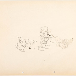
#4 Mickey, Minny and Pluto - "Mickey's Gala Premiere" - 1933
Issue to be addressed - Acidic damage to the paper, Pluto was actually a cutout and adhered to the paper. Pluto was also poorly positioned on the page, and the leash drawn was not originally done by the animator. Here is a comparison of the relative positioning of the characters.

Due to the fact that there was some acidic damage, due to poor storing, we went ahead with restoration to flush out the acidity and remove Pluto from the page.
After restoration Pluto had been completely removed, though there was some staining from the adhesive used.
Once we had enough pieces of the animation via screen shots, we went to work on creating a piece that was better suited to the situation.

Off to the printer it went and then another bout of stenciling, while Pluto was attached the face of the background using a archival adhesive and then onto framing.

Framed with a triple matting, a black core optic black mid matting, with a shadow to keep the Pluto and the stenciling clear from the glass, finished with an art deco style black frame.
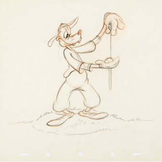
#5 Goofy - "How To Play Baseball" - 1942
Issue to be addressed - none, just a good idea.
This was a recent project of ours, now we have had some very nice pieces of Goofy in the past and wanted to challenge ourselves with this piece, after looking at the animation we realized that this piece wasn't a part of the animation whatsoever, but in actuality a rough drawing for the animation.
During our searches we came across another piece from the same animation.

We thought to ourselves, wouldn't it be kinda neat to take that rough drawing and turn it into a poster? so we approached our client and pitched(pun intended) the idea, the client loved it and told us to take a swing at it(last one) and came up with our own version of the poster. After the client gave approval, we went from print to stencil to frame, which turned out like this.

Double matting with a shadow to clear the stenciling and finished with a blue/grey distressed frame.
#6 Chip and Dale vs. Donald Duck - "Dragon Around" - 1954
Issue to be addressed - Generic background had nothing to do with the animation and we had too good of an idea to pass up.
This piece turned out much bigger than its original size, mainly due to the fact that inspiration took over.
We approached the client with a rough draft of the intended background.

Now it didn't look like much but with a bit of imagination! you could see the potential!
The image was intended to encapsulate the entire animation in one picture, a lofty goal, but not something we would regularly shy away from.
With over 100 layers, we were able to create a fairly good representation of the animation, we've put together a little time lapsed gif to somewhat illustrate the some of image assets that were create for this project.

After many lengthy hours of photoshop work, we were able to have a finished piece ready for printing, though as extravagant as this piece seems, there was one more piece needed to finish it off.
In the title screen of the animation, there was a coat of arms that our client was intrigued by, we had already come so far, why not go a little bit further.

Though the original version was in high definition, the image was still too low in resolution to work with, especially with what we were intending on doing with it. so we jumped back on the computer, cleaned it up and made it much more crisp. Once we were finished, we tasked our preferred printing company to print the piece onto a white acrylic, then had it die cut to shape and then we were ready for framing.

The piece was framed with a double matting, with a shadow and a shield shaped protrusion opening at the bottom, finished with a rust textured wood frame.
So there you have it, We had a lot of fun working on them, hope you enjoyed this post.


